How to Layout a Website Homepage in 4 Easy Steps
How to Layout a Website Homepage in 4 Easy Steps
BY MICHELLE KNIGHT
You’ll typically find yourself in one of two boats when it comes to having a website as an entrepreneur.
In one boat, you spend a lot of time, a lot of money, and a lot of energy on creating your website. Whether you've done it yourself, or you hired a team, bought a course, bought a template, or bought add-ons, you’ve spent the time, money and energy to have a website for your brand.
With boat number two, you are waiting to create your website, and it just keeps getting put on the back burner because it's incredibly overwhelming.
And no judgment, I spent, eight months creating my website, only to scrap the entire thing and start over because I didn't know what I was doing. Turns out your brand plays a really big role in your website, something I didn’t realize 5 years ago. It’s one of the reasons I teach the importance of having a solid brand foundation BEFORE you build your website.
If you need a little more love in the branding department, make sure you watch my free on-demand class where I’ll teach you my signature Build a Better Brand Method. Watch it here.
For our purposes right now, let's just assume that you've done the branding work because it is necessary. Don't think that you can jump in with this 4-part framework I'm about to give you, without knowing your brand and your message and your mission and your ideal customer, because it's just not going to work.
That's my disclaimer. It's out of the way.
Now let's talk about the 4-part framework.
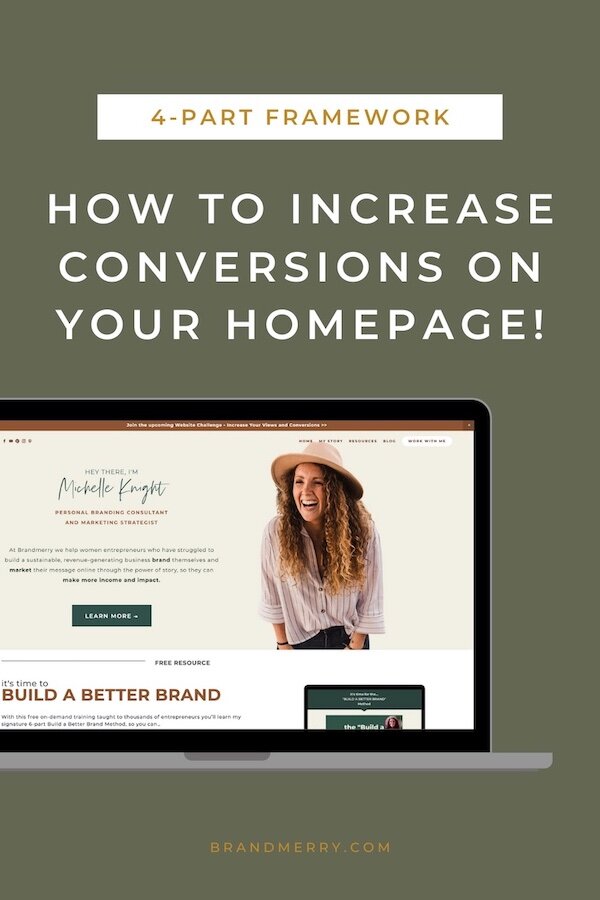
WEBSITE HOMEPAGE TEMPLATE: 4-PART FRAMEWORK
Now, one of the things that I learned when I started implementing more SEO, search engine optimization, into my business is that my homepage was getting a lot of traffic.
One of the things that I teach inside of Brandmerry Academy is getting your homepage to rank in search engines for your industry because the quality leads you get are just perfection!
Things like site-wide SEO, your site title, your site description and more all help you rank on Google and all of that traffic is going to lead to your homepage. Sometimes we think about SEO only working for blogs, but one of the easiest things that you can do when you're starting your business is focus on the SEO traffic for your industry and ranking for your industry.
As I mentioned in last week’s blog, people who are in the fifth stage of the buying process are ready to buy and they're coming to your homepage where they will decide if you’re the right brand for them.
So that homepage better be working for you.
I realized pretty quickly my homepage was not working for me and I needed to switch it up a bit. I implemented what I now call my 4-part HOME framework, you see what I did there? HOME is the acronym that we're going to dissect for the homepage.
I discovered this by accident and fine-tuned it. And I've been teaching it ever since. So let's dissect the HOME 4-part framework for your homepage.
Homepage Framework Step 1: HOOK
H is for hook.
Listen, if someone's coming to your website, they are probably going to peace out in like eight seconds if you don't hook them. That's why this is one of the most important things that you can add to your website.
This is typically right at the top before anyone has to scroll down or take any action. And it tells the person who is viewing your page, exactly who you are, who you serve, and why you are going to support them in solving their problem, or how you support them in solving their problem.
Remember, as marketers and business owners, we're solving problems. That's what we do.
That's why people invest in our products and our services.
They have a problem
They're aware of the problem.
They're seeking a solution and ta-da, they're finding you as a solution, or your product, or your service to their problem.
Your goal with your brand is to attract or repel. You want to make sure that your hook is hooking in the right people and sending away anybody that isn't the right fit for you.
So, to recap your Hook should outlines:
Who you are
Who you serve
How you help them go from struggle to desire (the goal they ultimately want)
This is something I teach inside of Brandmerry Academy. One of the first bonuses you get is all about writing your signature Brand Bios and one of those is your Hook.
Homepage Framework Step 2: OPPORTUNITY
Then we move down the page a little bit to O.
O is for opportunity.
You want to give anyone that has now been hooked an opportunity to learn more and to join your email list.
This is where I love to include your freebie opt-in.
Now inside of my program Brandmerry Academy, one of the first things that we focus on is creating some sort of freebie, or lead magnet, so that as you increase traffic to your website, people are taking advantage of your lead magnet and joining your email list.
Your email list is gold. This is how you stay in contact with your brand. This is how you share important promos and updates.
People who land on your website, then disappear, are hard to stay in contact with if they aren't on your email list.
The best thing to do is include a button to a landing page or a form embedded so they can sign up for your free gift and join your email list.
Homepage Framework Step 3: MEMORABLE
Then that moves us down the page a little bit more to M.
And M is for memorable.
Listen, I teach storytelling and how we can apply it to our branding and marketing. It's kind of my thing. And one of the things that I love about storytelling is the fact that integrating story into your content, into your copy, makes it 22 times more memorable than if you didn't have any.
So, this is the point at which you become memorable to your ideal customer.
To do this, you also share a small ‘about me’ section and your mission. I call this the Bio Blurb and it’s something we teach inside Brandmerry Academy.
The goal here is to give your ideal customer more insight into who you are, your mission, the work that you do, and allow them to read more on your full ‘About Me’ page.
This is a great opportunity where you can connect through empathy and build authority, which leads us to the final stage.
Homepage Framework Step 4: EXPERTISE
That leads us to the fourth part of the homepage, which is E for expertise. This is where you want to continue to elevate your authority.
Remember, people are seeking us out to solve problems through our products, through our services, and they want to know that we can guide them and we can support them.
So after you've hooked them, you've given them an opportunity to get a valuable free resource, you’ve shared your story, let’s just amplify that expertise, shall we?
This is where you can share really popular blog posts that provide education for your audience, and can ultimately help them make small little micro-changes with their problem.
You can show your expertise by highlighting features that you've been on. If you've been featured in Forbes, or you've been featured in Business Insider, or relevant podcasts for your industry those logos can be beneficial. But, it doesn't have to be those big players that we always think about. Sometimes those niche-down outlets, media outlets, podcasts, things like that, can mean even more to our ideal customer.
If you have a podcast, you can share podcast episodes so they can explore additional resources from you.
You can also share testimonials. If you've had clients who have seen tremendous results, you can feature those on your homepage.
E is all about elevating your expertise and authority!
CONCLUSION
This is it.
These are the four things that I want you to have on your homepage. No more.
Don't overwhelm people with a million different options. Keep it simple.
Ultimately, when people land on your homepage, we either want to attract them or repel them.
Once we've attracted the right people, the ideal customer, because nobody else matters, then we want to give them an opportunity to join our email list, to learn more, or to buy almost instantly.
And creating a homepage like this is going to support you, in sending people in the different directions that you ultimately want them to go, while keeping it simple and not overwhelming.
Overwhelming your audience from the first thing that they see is a surefire way to lose them.
If you are ready to dive in to increase those website views and ultimately those conversions, this is exactly what we teach inside of Brandmerry Academy. Learn more at Brandmerry.com/academy.
P.S. Have you tuned in to The Beautiful Climb podcast? I release new episodes every other Friday on topics around productivity, motherhood, habits, goals and going after the life of your dreams! Check out past episodes and be sure to subscribe at thebeautifulclimb.com
- FREE GIFTS YOU'LL LOVE -
DISCOVER YOUR BRAND STORY IN UNDER 5 MINUTES
LEARN HOW TO WRITE AN ‘ABOUT ME’ PAGE THAT CONVERTS
MAP OUT 30 DAYS OF CONTENT IN UNDER AN HOUR
- READ THE LATEST POSTS -
MEET MICHELLE
Hey there, I'm Michelle Knight and I an online branding and marketing consultant for female entrepreneurs.
I believe in the power of storytelling and using that superpower to brand and market yourself online...oh and to set yourself free.
I'm obsessed with living a life of freedom, so much so, that my family and I now travel full-time while running my business from the road.
This blog serves as a home base for all things branding, marketing, content creation and more.


